The Client
Toronto Athletic Club, a super-premium fitness club in downtown Toronto, member of the Cambridge Group of Clubs.
Business Objective
Re-brand and revitalise the Fitness Institute’s downtown Toronto club, recently acquired by the Cambridge Group.
Background
The Cambridge Group acquired the downtown Toronto Fitness Institute club in 2000. The Fitness Institute brand began in the mid-1960s, and was a true innovator in bringing science to the Toronto-area fitness club business. The downtown Toronto club was built at the top of the (now) TD Waterhouse tower and became the brand’s flagship. After more than two decades of success, the brand was acquired by food giant HJ Heinz Company and then allowed to stagnate throughout the 1990s.
The Cambridge Group concentrated on improving Toronto club’s facilities and operations for the first few years of ownership. When Coyote began the first branding campaign in 2004, the club was at 65% capacity and just breaking even. Legal requirements of the acquisition dictated that Cambridge Group could only use the Fitness Institute brand until 2006.
The Strategy
Coyote believed there was still positive equity in the Fitness Institute brand, so the club was repositioned under the Fitness Institute Toronto (FIT) brand name, and the brand graphic was updated.
FIT was positioned as the business-class fitness club. The critical consumer insight was that the target group sought the status of exclusivity in choosing a fitness club, but didn’t to be overtly arrogant or obvious about that desire. Interestingly, this insight came to light when a member’s note to management was casually read aloud in an early creative meeting.
For 2006, FIT was re-branded as Toronto Athletic Club, though the positioning remained constant.
The Execution
FIT’s 2004 repositioning campaign took a graphically icon approach which focused on the club’s key physical attribute as a metaphor for what truly drives the target group —its location at the top—with Swimmer, Squash and Clinic. The key media was photographic-quality transit & mall posters and select magazine & business newspaper.


It was at this point, for both legal and marketing reasons, Fitness Institute Toronto was re-branded as Toronto Athletic Club. This was done through a thorough three-month process that involved member & consumer research. The original campaign brand positioning was the strategic basis for the new corporate ID.
Branding evolution
before Coyote:
first Coyote update, 2004:
Coyote's 2006 re-branding:
Along with the club’s re-branding in 2006, we sought members from new demographic segments with Young Executive and Yoga.


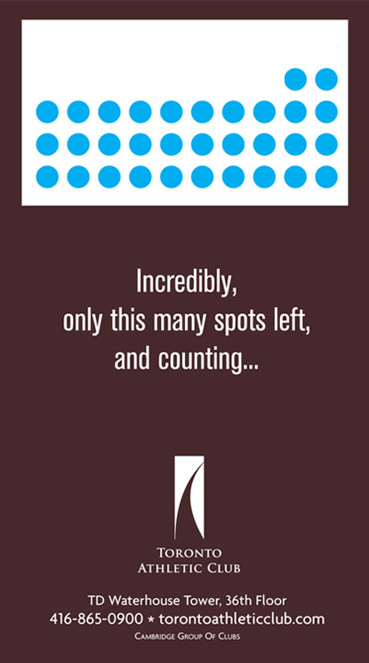
By 2008, we were in the wonderful position of being able to count down our remaining membership spots on a daily basis using online and video media with Countdown.
The Results
The 2004 repositioning campaign began a Fitness Institute brand revival lead by the Toronto flagship club. The 2006 re-branding went smoothly and membership growth accelerated. Our campaign was recognised in fitness industry and business media publications.
By 2008, the newly-renovated Toronto Athletic Club was filled to capacity, and remains so today.
Club Membership as a % of Capacity Over Coyote’s Campaign Duration
Campaign Creative Credits
Copywriting: Heather Chisvin
Art Direction: Patricio Davila
Graphic Design: Jennifer Shadbolt
Photography: Derek Smith