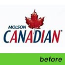
An innocuous little throw-away at the end of a story in Marketing Online caught my attention and jostled my memory the other day. It was a report on Molson Canadian’s new ad campaign from Zig. The article outlines how Zig’s new campaign evolves the iconic Canadian beer brand, includes the requisite client praise, and then ends with, “New York’s Spring Design Partners handled logo and packaging redesign duties.”

The answer might be in who really owns the brand now, though it seems to okay for a Canadian agency to handle the advertising. What did they get? A bigger, more realistic maple leaf. Less iconic symbolism.

There is a reason for this identical result.
Marketers will always have a responsibility, along with agencies, in lifting Canadian marketing higher into the light. No one understands Canadian symbolism better than Canadians, so when you are dealing with a brand deep in Canadian DNA, keep the work here. This isn’t marketing xenophobia, it’s just good business.


